Author’s Notes: “In this custom single player level for Half-Life 2, Gordon Freeman has been sent to a city that has been taken over by Combine hostiles. He must eliminate all enemy threats and rescue the remaining civilians.
This map was produced for my Final Major Project at University. The look of the map was inspired by the modern architectural styles of the United Arab Emirates.”
- Title: Light Pollution
- File Name: hl2-ep2-sp-light-pollution.7z
- Size : 8.74MB
- Author: Daniel J. Friend
- Date Released: 21 June 2010
Download directly into MapTap 8[.74MB]
You MUST have MapTap installed before using this link.
You can still use it with MapTap once you have downloaded it.
- Copy lightpollutionbeta.bsp into your Half-Life 2: Episode Two Maps folder.
- Launch Half-Life 2: Episode Two
- Open the console and type map lightpollutionbeta.
- Press enter/return or click the Submit button.
- Play and Enjoy.
If you require more help, please visit the Help page.
None

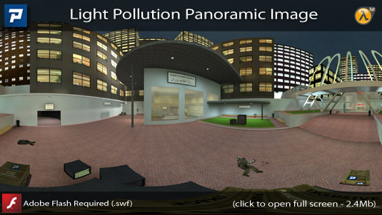
Please Note: Panoramic images only are available in full screen mode. You can either open one by clicking the image link above or by saving it to your computer and then opening it locally.
How to use: Once the image is open and your cursor is on the image, press and hold your left mouse button and move around the image. Use your mouse wheel to scroll in and out of the panoramic image.
Click on the thumbnails below to open a 800 pixel wide image.
WARNING: The screenshots contain spoilers.
 |
 |
 |
 |
 |
 |
 |
 |
 |
 |
 |
 |
 |
 |
 |
 |
 |
 |
Please note: These statistics are valid from December 2010
-
1,702Overall
-
0Today
-
0Last 7 days
-
12Last 30 days
-
92365 days
Using Gauge: Users
Manually: 3 Users
Time Taken:
Average: 0 Hours, 13 Mins
Shortest: 0 Hours, 3 Mins by JetBlueChest
Longest: 0 Hours, 20 Mins by Daken50
Total Time Played: 0 Hours, 38 Mins
This release is currently not in a collection
If you believe this release is missing important tags, please suggest them in a comment?


I’m torn. The reason being that I enjoyed the gameplay but didn’t like the setting. It’s too bland and empty and screenshot 6 is a good example.
I understand why the author wanted to sue the style but just feel that it requires more detail. Of course, that’s how the real place could look but I don’t think that’s the point.
I am unclear on the inclusion of the crossbow as I never really get a chance to shoot from a distance but hey, who doesn’t enjoy the crossbow?
A nice portfolio piece but falls short of feeling part of the HL universe. Now if we had some modern architecture that had been modified by the Combine, that could have been a welcome addition to the map.
In short, play it for the gameplay not the depth of design.
I think this is an HL2 map not EP2. Probably doesn’t matter but I put it into HL2 and it plays just fine.
Those who do not have EP2 need to know.
Daniel Friend has excelled at bringing HL2 to the modern architectural styles of the United Arab Emirates.
What a refreshing change. Lovely.
Darned good mapping and superb combat gameplay.
The Combat in Hard is just that – hard but at no time are you overwhelmed. The pacing is spot on.
Pros: Absolutely everything except –
Cons: All very, very minor – Needs background sound/music. The rubbish in one place was a bit overdone (and very solid!).
Definitely a superior map. Brilliantly thought out and planned.
Very well done indeed and thank you Daniel Friend.
Excellently planned combat game play
The appearance reminded me of Mirror’s Edge to begin with, but after a while it started to bore me. Phillips, right – it is bland. It looked like an old HL2 map rather than one for Ep2.
However, of more importance is the gameplay and that is excellent. The combat was a bit frantic at times, and more health packs here and there would have been nice.
More textures and I might have made this a Personal Fave.
I liked this mod. It was short, but quite active for play. The only thing I am not sure I liked was the bright and bold colors – I suppose that’s how things look but … never having seen any photos of the area up close, I can’t say 😉
I *did* use the crossbow, it was extremely handy right before the end.
A well done map, very nicely worked, with good action and just enough plot to be slightly more than a run and gun experience. 🙂 I’ll probably go through it again just to explore it.
While it was a bit too bright and shiny for a location where there’s combine around, this was an enjoyable romp. The city was a little too clean so I assume it surrendered without a fight, that and if you look at the windows, there are faces in what appear to be offices.
At the start, the metro train was way too wide; however as a student piece such things are forgivable. After a few minutes play you start to expect a bad guy to be behind any large boxes and sure enough that happens throughout the game, but the game’s no worse for that.
The action was a little too easy and at times predictable and at the end it would have been a good touch to have seen the hostages freed and legging it.
All said and done this is a good level, but not a great one!
You should play this on Hard mode.
You should also play some orchestra music in the background, to compensate for the lack of soundscapes.
I thought this was well worth the download.
The repetitive textures, constant bright lighting and lack of any ambient sounds, except for my boots, took away from the great gameplay. The environment was so bland that the trash pile seemed totally out of place.
However, I liked the combat, the close-in city scape and the archway design. I got a laugh out of seeing the HEV suit charger and health charger located in the men’s room.
It’s a good map that could be made great.
as a mapper I tend to notice the mapping and gameflow, and although the gameplay was good I thought the mapping could have been better… a few grips I have but overall it’s an ok map.
-could have been rescaled to the standard HL2 scale… most of the map was incredible large, most notably doorways (This was most likely to recreate the target location)
-middle section could be better optimised (in my opinion)
-needed more cover (again…my opinion)
-I agree with Phillip that it was bland
-ramps
what I liked most about this map was it’s textures… I only spotted a few stock textures…and a LOT of the custom textures were top quality
As strictly a player and not a mapper I found this to be a fun short play, the brightness and different scenery IMO was refreshing. I like maps/mods that have well placed combat, enough but not too much health and or ammo and a clear objective and map end.
A map of little distinction showing common signs of inexperience mapping, large empty areas with varying and bright wall textures make for a very boxy and basic design.
The back drop of office buildings with windows aglow from internal lighting set against the darkness of night, was the only redeeming feature of this below par piece of work.
No doubt much was learnt from this project and I hope it will lead to better things in the future, to some extent the design was too ambitious for the mapping skills at hand, and we were left with some thing that does not aspire on any front.
Quite a quirky little map, with very large and open architecture which was a good break from the old HL2 repeated cramped and dirty locations. Having messed with the Ai in source myself I began to notice a certain lacking in squad coherence, enemies one floor above would not hear the massacre below, felt a touch odd but it stopped you being over-run at any one point. Gets a one up from me for the early inclusion of my beloved shotgun, which did sound about 110% more lethal in the echo prone rooms.
Overall, 4/5 nice level for combat and architecture ,though not much else.
Cool map I like it, it feels like u are all the time in a realistic scenario taken by the CMB, I agree that most of the time u found poor combat than could have had, and the hostages are alredy dead by the time u reach the end and the final text on the screen says they will be allright WTF?” I thought”!, that’s just a silly detail, over all i’d love to play this map for counter strike, that would be also really interesting and because it feels like that a CS map, but into the HL world, so go on and get it is cool to play this maps while there are few things to play actuually.
I almost made this a PF ….. darn it’s fun!!!! It’s very old skool with open mapping (like a Doom era game) and it’s damn fun. Love this!!!! Hoping to see more like this from Daniel. Awesome stuff 🙂
Manually
Medium
15 Minutes
It’s bland and big but it still works. Game play is good.
Manually
Easy
20 Minutes
Really really short. Best for 1 weapon only
https://www.youtube.com/watch?v=XFvbGbI9S0g
Manually
Easy
3 Minutes