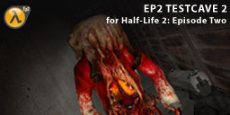
A simple underground map where you work your way through various rooms.
Basic Details
- Title: EP2 Testcave 2
- File Name: hl2-ep2-sp-ep2-testcave-2.7z
- Size : 254.13Kb
- Author: Pelikoira
- Date Released: 15 March 2010
PlanetPhillip Download Servers
- PlanetPhillip.Com
- Copy ep2_testcave2.bsp into your Half-Life 2: Episode Two Maps folder.
- Launch Half-Life 2: Episode Two
- Open the console and type map ep2_testcave2.
- Press enter/return or click the Submit button.
- Play and Enjoy.
-
839Overall
-
0Today
-
0Last 7 days
-
6Last 30 days
-
51365 days
Installation Instructions
If you require more help, please visit the Help page.
Screenshots
Click on the thumbnails below to open a 800 pixel wide image.
WARNING: The screenshots contain spoilers.

|

|

|

|

|

|

|

|
Reader Recommendations
Total Downloads
Please note: These statistics are valid from December 2010
Meta Review Data
Statistics based on 1 comment(s) with meta review data.
Installed:
Using Gauge: Users
Manually: 1 Users
Time Taken:
Average: 0 Hours, 10 Mins
Shortest: 0 Hours, 10 Mins by Steve
Longest: 0 Hours, 10 Mins by Steve
Total Time Played: 0 Hours, 10 Mins
Using Gauge: Users
Manually: 1 Users
Time Taken:
Average: 0 Hours, 10 Mins
Shortest: 0 Hours, 10 Mins by Steve
Longest: 0 Hours, 10 Mins by Steve
Total Time Played: 0 Hours, 10 Mins
Tags (?)
Collections (?)
This release is currently not in a collection
If you believe this release is missing important tags, please suggest them in a comment?
Jump to a review


Having just posted Pelikoira’s first map, I now post his second. It’s hard to noticed any improvement between the two and the problem is one of objective rather than skill.
Building different styled rooms with various colours and putting them together is good practice but ultimately worthless if you can’t make a level that make the player they are in a real setting.
There are various levels of realism but neither this map nor his first make me feel that I am not playing a level. The coloured lights just add to that feeling.
My humble recommendation to Pelikoira is to take your time for the next release and build something that could really exist. Then give it a reason for existing, then a reason for the player to be there.
Finally, make a clear beginning, middle and end. The end should have the finale and make the player feel as though they accomplished something worthwhile.
5 Words Or Less Review
Too many coloured rooms.
I enjoyed this more than the first one and Zombies and Combine were kept apart.
My comment for the first one applies here although I did enjoy it a little more and was quite disappointed when I ran out of Combine to kill and the map ended.
For me, OK to play and I’m glad I did, just the once.
Can’t say too much here. It could have been a bare bones start for something potentially far more clever ( challenge wise ), but it was just too small and ” lean “. I don’t follow with releasing this type of
” learning as I go work ” as a mod. The time should be taken to explore your creativity and imagination in the effort to create something substance.
the atmosfere was less interesting than in the first one it has still this biginner touch and a limited interest just comes out…also I really hate those traps (falling bridge) were you get stuck with no solution to get out
Yeah… That was bad mistake from me…
I should have placed some kind of trigger_hurt there or something.
The combat in this map was more intense than in the first. (Of course, the Combine combat in that one was pretty intense the first time I went through–the second time I played that I was better. I’m sure the same would be true for this map.)
I didn’t mind the bridge, perhaps because only a couple boards broke (for me) so it was easy to jump.
I don’t like “you absolutely must take fall damage” situations, like at the beginning. Where did I fall from? Could I have come down more slowly and taken less/no damage?
Pingback: Garść informacji…
I’m sure most will look upon this as lame… I guess it is in comparison to the usual quality but I can see potential here for a good mapping future as I liked the layout and simple surprises. Really nice old skool shoot ’em up fun too. I did enjoy it.
Manually
Medium
10 Minutes